Image Source: Anant Kadiyala
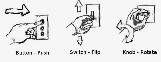
Affordance gives users a visual hint on what actions they can take.
For example, when we see a button, we instinctively want to press it, or when we see a switch, we feel like pulling it. On an app or website, a rectangular box with a border makes us think we can click and type into it. These cues play into human psychology.
Thus, affordance is a crucial element of visual user interfaces. The clearer the visual cues are, the less ambiguity there is for the user to understand what action is expected.
In mobile environments, the importance of affordance becomes even more pronounced, as the small screen size and limited space make it harder for affordance to be as visually obvious. Therefore, clear affordance is critical to ensure smooth user interaction on mobile devices.
Good case - Traffic lights that show the remaining time

Image Source: Busan News
1. Clear Information Display
- Traffic lights that show the remaining time provide users with clear information on how much time is left before the signal changes. Pedestrians can easily determine whether they have enough time to cross the street, and drivers can predict when the signal will switch. This intuitive display helps users make more informed and safer decisions.
2. Behavior Guidance
- The countdown timer allows both pedestrians and drivers to act accordingly. Pedestrians can choose to cross quickly if there is enough time, or wait for the next signal if time is running out. This guides user behavior and enhances traffic safety by reducing risky actions.
3. Meeting User Expectations
- In addition to simply showing red or green lights, the countdown timer allows users to predict signal changes more accurately. This design meets user expectations by providing precise information, reducing stress at intersections, and improving overall traffic flow.
Bad case - Keyboard
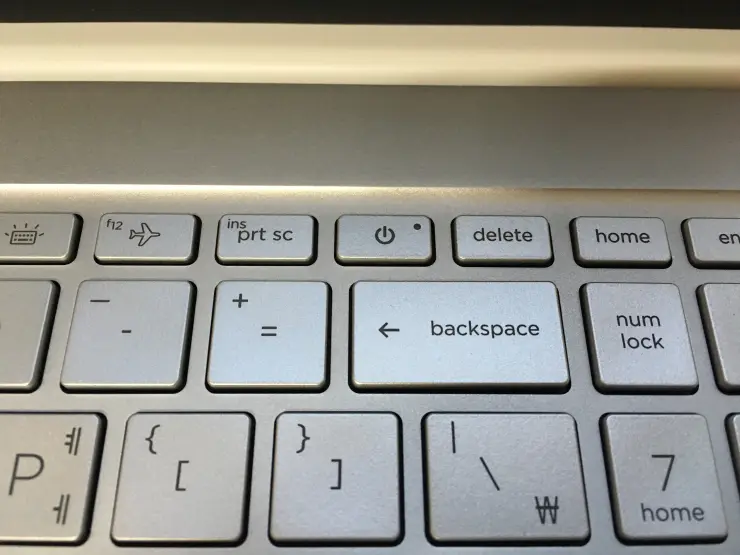
Image Source: https://www.clien.net/service/board/park/16744923
The placement of a power button above the delete key on a keyboard is a bad example of affordance.
1. Risk of Accidental Use
- When the power button is located too close to the delete key, users are more likely to press it accidentally, potentially shutting down the system unintentionally. The functions are too distinct to be placed so closely.
2. Functional Mismatch
- The delete key is frequently used, whereas the power button is not. Placing such an important function near a less frequently used key increases the risk of errors and reduces the overall usability.
3. Contrary to User Expectations
- Users do not expect two very different functions to be positioned so closely together. This placement disrupts the intuitive understanding of how the keyboard should work.
Solutions
1. Relocate the Power Button
- The most straightforward solution is to move the power button to a location further away from frequently used keys like the delete key. For example, the power button could be placed at the right-top corner of the keyboard, near the function keys or in a separate, more isolated area where it’s less likely to be pressed by accident.
2. Add a Confirmation Step
- Implementing a confirmation step when the power button is pressed would prevent accidental shutdowns. For instance, instead of instantly shutting down the system, the button could trigger a prompt asking the user to confirm the action.