Image Source: By John O'Malley
Dark patterns are UI/UX design techniques intentionally crafted to exploit human psychology and trick users into doing things they don’t necessarily want to do. The British UX designer Harry Brignull, who first coined the term, described dark patterns as follows
“A carefully crafted user interface designed to trick users into performing actions such as signing up for insurance or signing up for recurring bills.”
In other words, dark patterns refer to UI/UX that is cleverly and intentionally designed to elicit certain actions from users, whether they want to or not. These designs often serve business goals, such as increasing subscriptions or data collection, but they do so at the expense of the user’s autonomy, leading to unintended actions like accidental purchases or subscriptions.
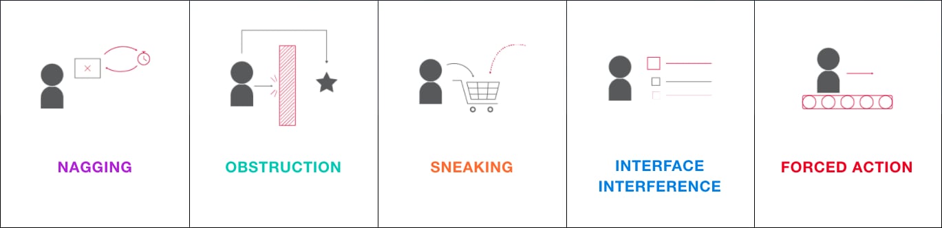
Types of Dark Patterns Design
Here are five types of dark patterns commonly seen
- Nagging
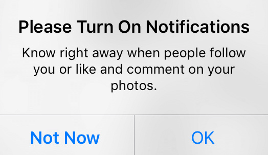
Image Source: ResearchGate
Nagging occurs when an app or website repeatedly interrupts the user’s progress with prompts or messages, draining their time and attention. These interruptions can make the user feel pressured or annoyed, leading them to eventually agree to the message or request—even if it’s not what they want—just to move forward.
If the interruptions happen frequently, the user might decide that giving in to the prompt is easier than continuing to dismiss it. This pattern is commonly seen in requests to subscribe to premium services, allow notifications, or share personal data, and it can result in a frustrating user experience.
- Obstruction
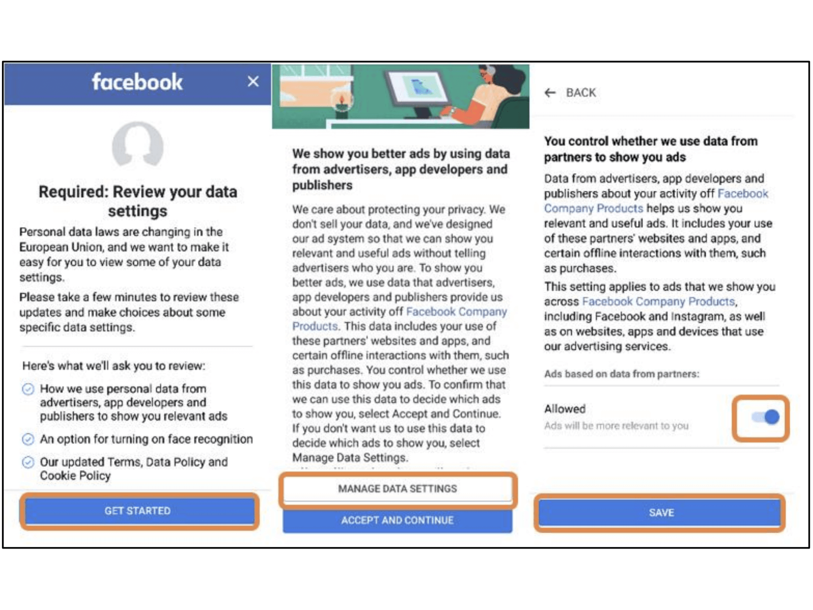
Image Source: Norwegian Consumer Council, 2018
Obstruction involves intentionally making certain tasks difficult or confusing for the user. It artificially complicates the steps required to perform actions that the user might want to avoid, such as canceling a service, deleting an account, or disabling ads. Designers create complex menu structures, lengthy procedures, and multiple confirmation steps to increase the likelihood that the user will give up.
For example, in this image, Facebook requires users to review and adjust their data sharing settings across multiple screens. Users must navigate through detailed information and various options to disable data sharing with advertisers. By making this process lengthy and complex, users are more likely to accept the default settings, even if they intended to limit data sharing.
- Sneaking
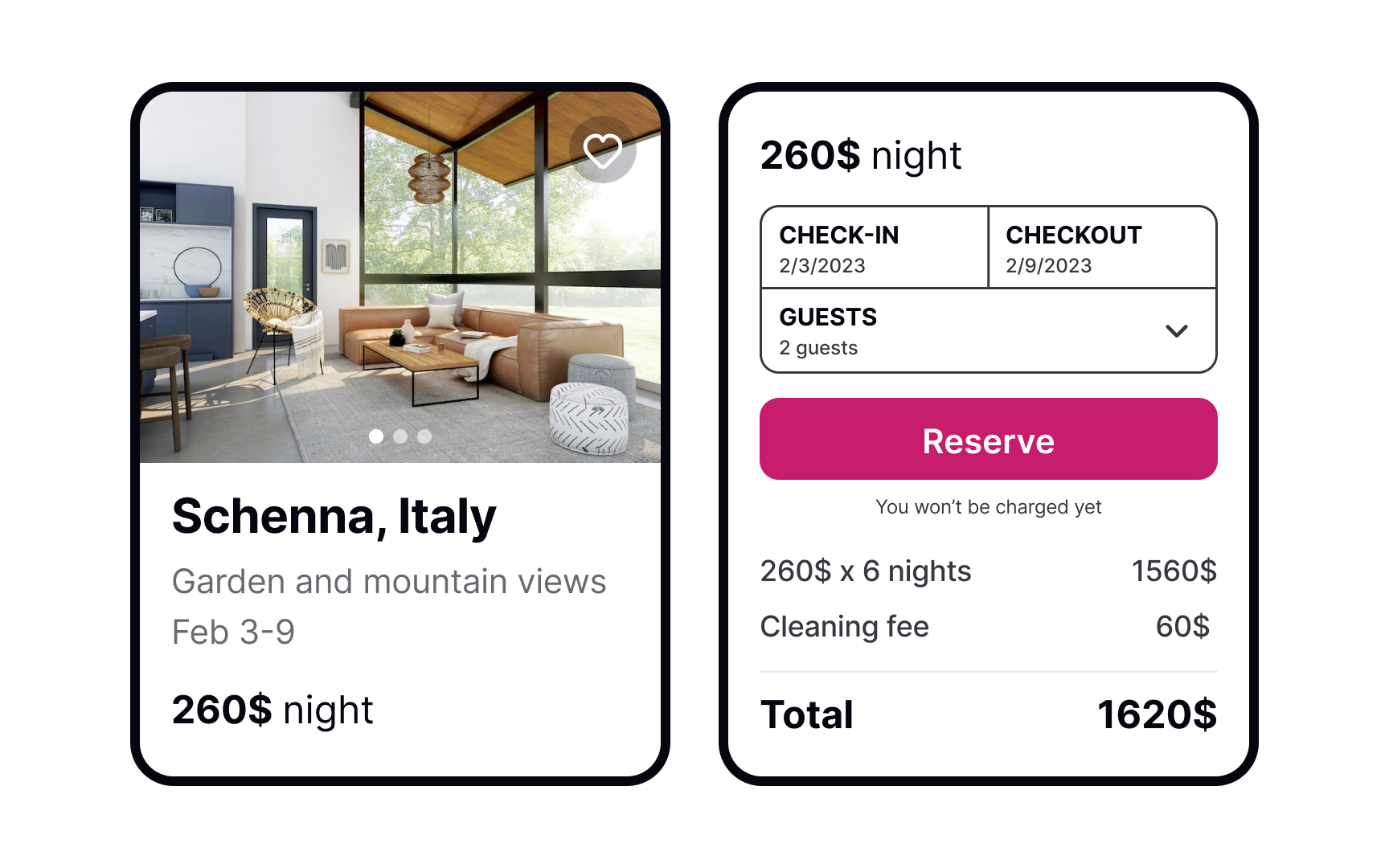
Image Source: Uxcel
Sneaking occurs when important information, such as additional fees or terms, is hidden from the user until the last possible moment. This pattern is often used to make a product or service appear cheaper or more attractive than it actually is, only revealing the true cost or consequences just before the user commits.
For example, an accomodation booking site may show a price at a discounted price, but hidden fees like cleaning costs is only added at the checkout stage. This tactic leaves the user feeling deceived and frustrated because they weren’t provided with full transparency from the beginning.
- Interface Interference
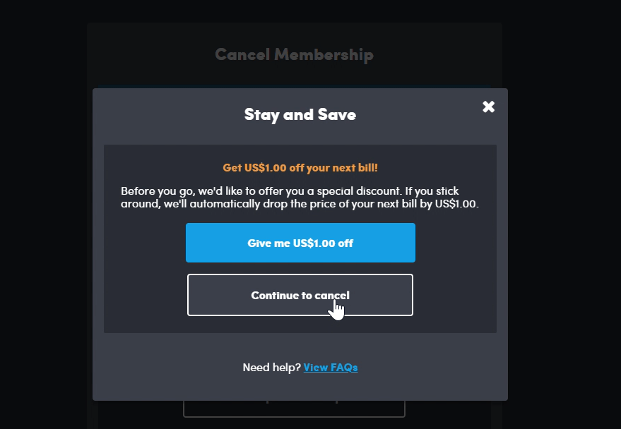
Image Source: By Cai & Roberta
Interface interference manipulates the design of user interface elements—such as buttons, links, or menus—to confuse or mislead the user. This often involves making certain options (like opting out or declining a service) difficult to see or access, or placing desired actions in locations where users are less likely to find them.
In this example, the user is trying to cancel a subscription, but the interface prominently displays a blue button that offers a discount (“Give me US$1.00 off”), making it more noticeable than the “Continue to cancel” option. This visual manipulation influences the user’s decision, encouraging them to take the action that benefits the company (keeping the subscription) rather than proceeding with the cancellation.
- Forced Action
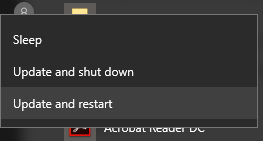
Image Source: blog
Forced Action refers to situations where the user is required to perform a specific action in order to continue using a service or complete a task. This pattern typically forces users to agree to terms, share personal information, or sign up for a service they may not want, simply to proceed with what they were doing. It can make users feel that they have no other option but to comply.
For instance, in this image, a user simply wants to shut down or restart their computer, but the only options available are “Update and shut down” or “Update and restart.” This design forces the user to perform an update, even if they would prefer to delay it, limiting their choice and making them feel compelled to take an action they may not want at that moment.
Examples
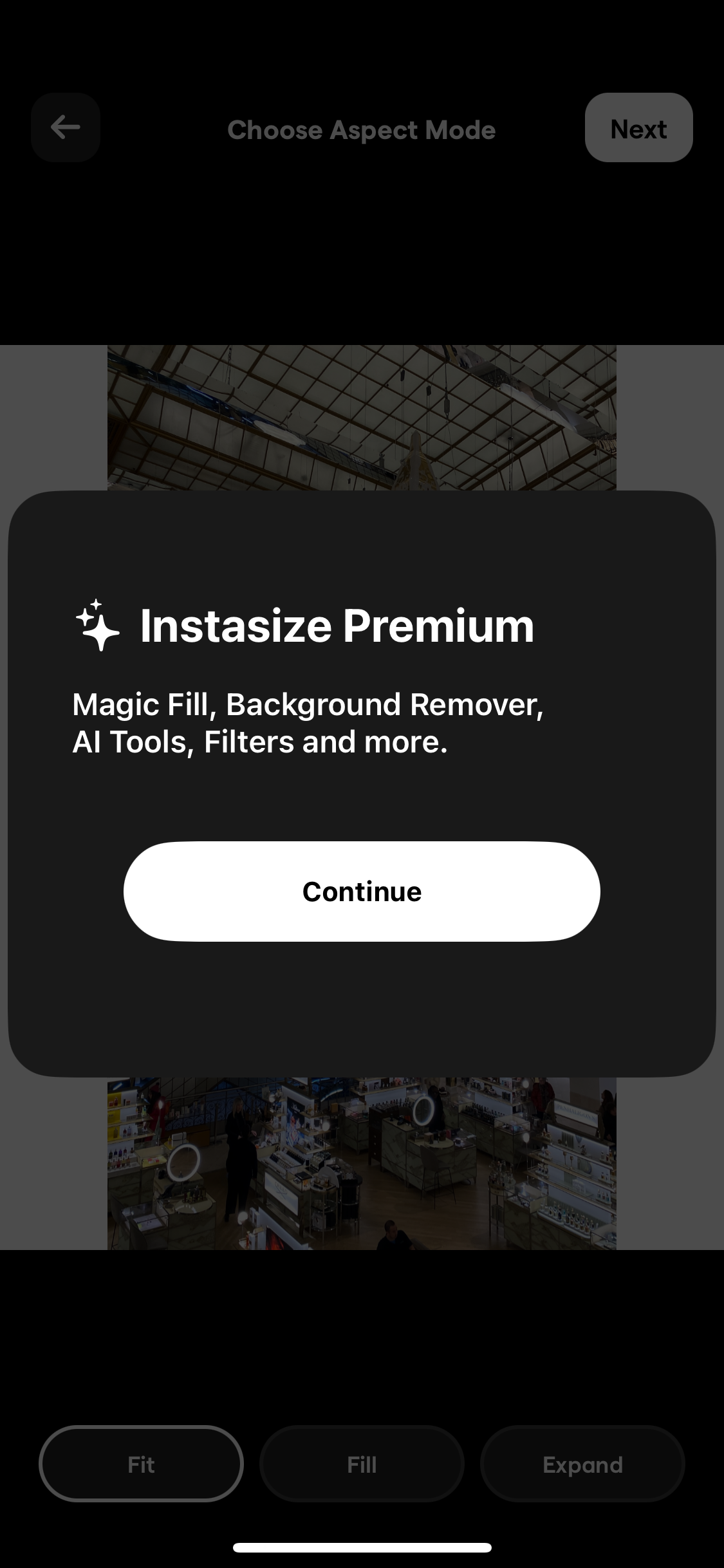
- Instasize Premium Subscription
- Instasize is an app that helps people resize photos for Instagram, ensuring that they don’t get cropped when posted.
Dark Pattern Explanation
Nagging
- While I’m editing photos, a premium subscription pop-up frequently appears, interrupting my workflow. Even though I’m not interested in upgrading, I keep seeing the same subscription prompt repeatedly, which creates a sense of fatigue and frustration due to the constant interruptions.
Forced Action
- The pop-up doesn’t have a close button, and I have to wait around 10 seconds for it to disappear before I can continue using the app. This lack of a “close” option makes me feel pressured into considering the premium subscription since I’m essentially held back from my task.
How to Redesign It
Add an “X” or “Close” button to the pop-up so that users like me can dismiss it immediately if we’re not interested, giving us full control over our experience.
Include an option in the app settings that lets users turn off subscription prompts if they do not wish to see them.
- Skyscanner Price Discrepancy by Country Setting
- Skyscanner is a flight search engine that allows users to compare flight prices across different airlines and book their travel at the best price. I often use Skyscanner to find affordable flights for my travels.
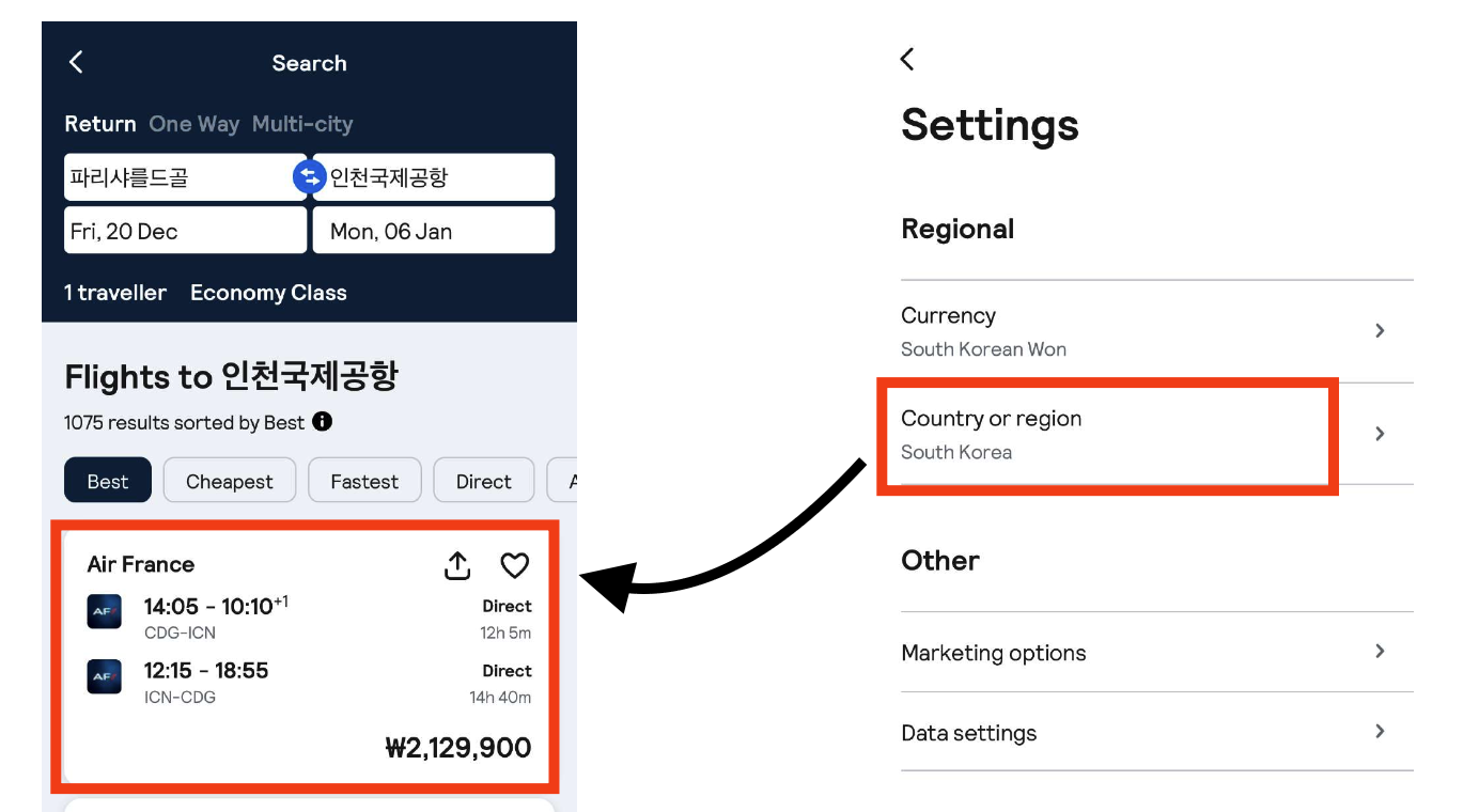
Price in Korea Setting
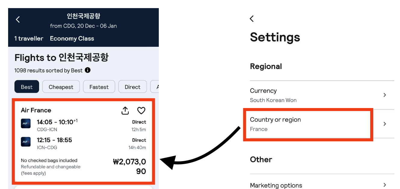
Price in France Setting
Dark Pattern Explanation
Sneaking
- When I set my country to Korea and search for a flight from Paris to Korea, the price displayed differs from the price shown when I set the country to France. This pricing difference is not clearly communicated to users, and the cheaper option is hidden unless they change their location setting. This can cause users to unknowingly pay more for the same ticket.
Interface Interference
- The interface automatically adjusts the price based on the selected country, limiting my ability to see or choose the best price across locations. Because there is no transparent way to compare prices across countries, users like me may miss out on the lower price option.
How to Redesign It
Allow users to easily see the price differences between countries by adding a “Compare prices across countries” option. This would help users like me make informed choices by seeing all available prices.
Display a note explaining that prices may vary depending on the country setting, giving users full transparency about potential savings if they adjust their location.