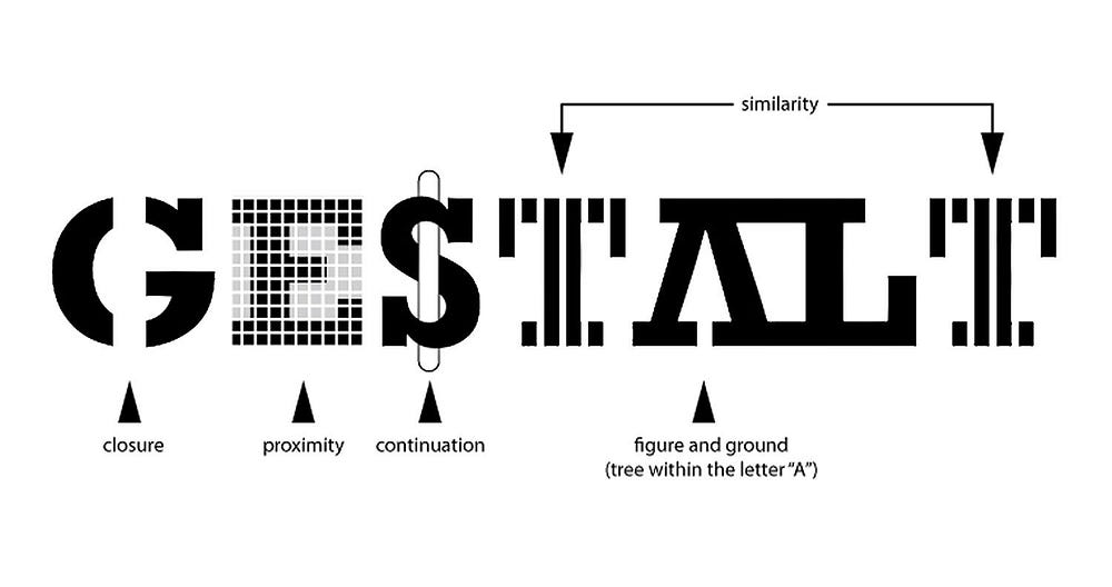
Image Source: Gestalt Principles
Gestalt is a German word meaning ‘form’ or ‘shape.
It refers to how people perceive visual elements in a given situation. Generally, we compare visual patterns and past experiences to make sense of what we see. We often perceive these elements as a single whole, rather than as separate parts. By connecting the elements, recognizing familiar shapes, sharing information, and filling in the gaps, we make sense of the overall picture.
1. Law of Proximity
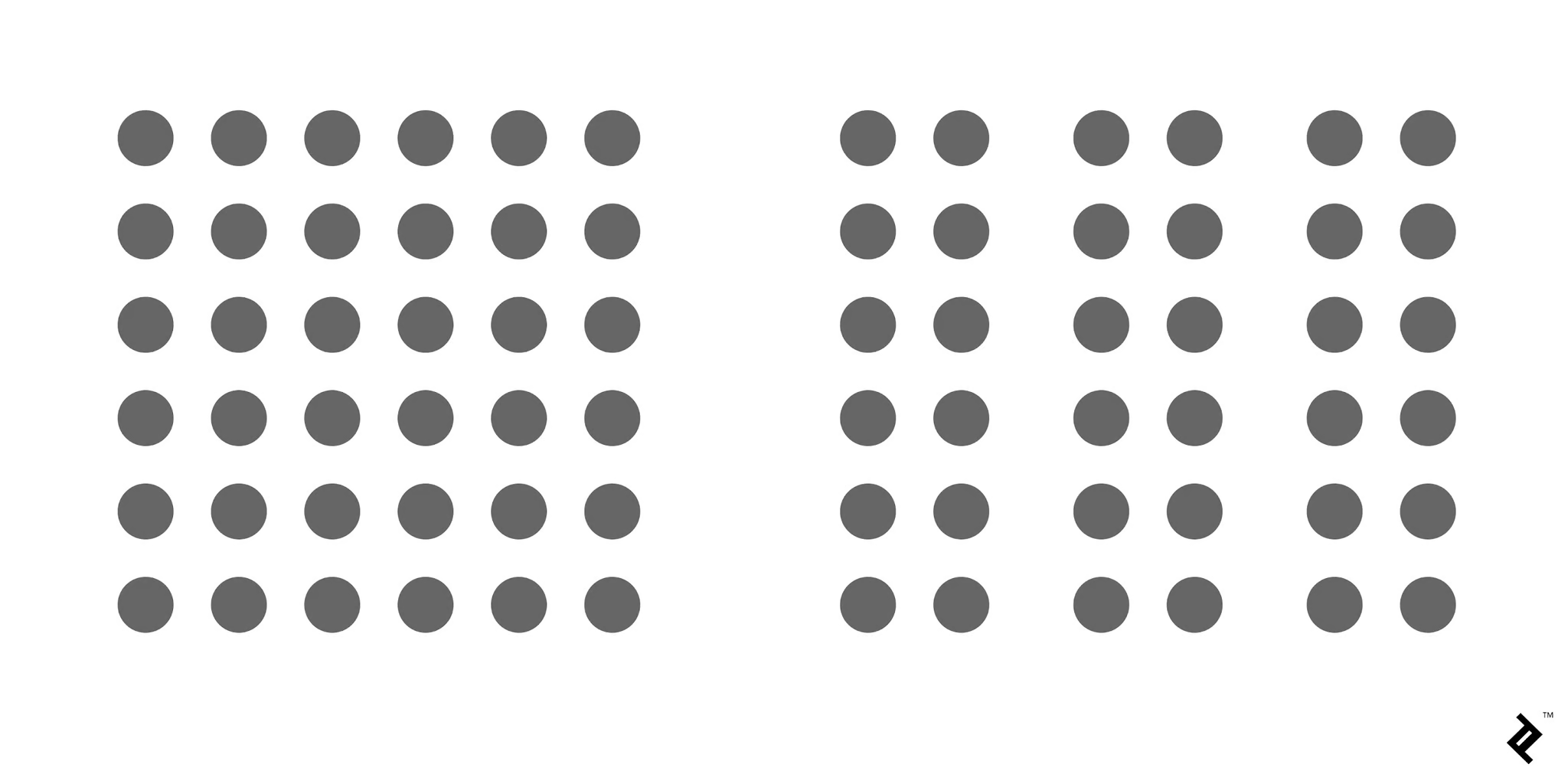
Image Source: By Cameron Chapman
The Law of Proximity descrives the phenomenon in which element that are close to each other are perceived and felt as a group.
For example, in the left image, the dots don’t appear to be grouped. However, in the right image, the dots are closer together making them appear as three distinct groups. This proximity can help in organizing related content by placing them close to each other.
2. Law of Similarity
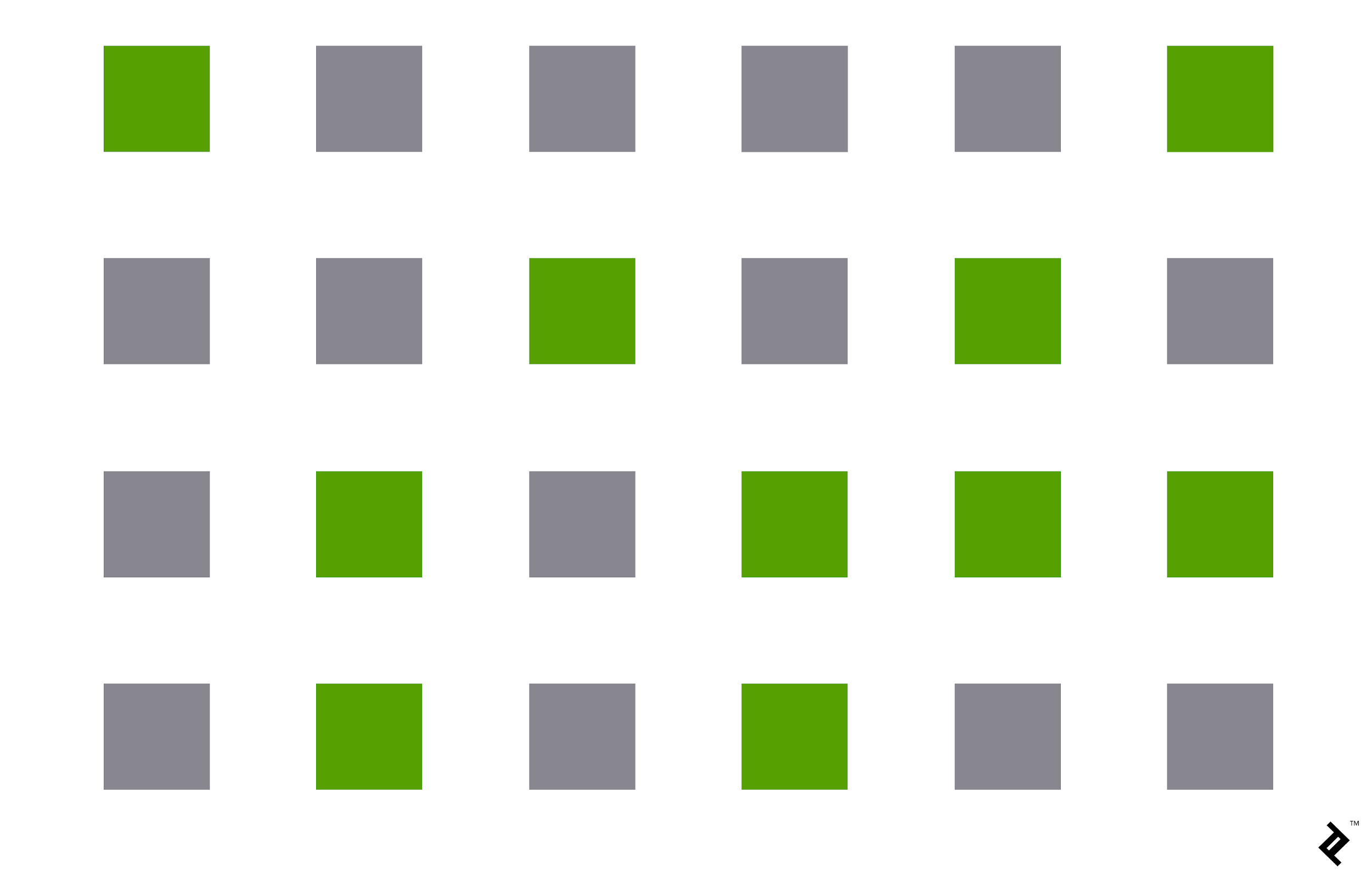
Image Source: By Cameron Chapman
The Law of Similarity means that objects with similar shpes, sizes, colors, or other attributes are perceived as part of the same group.
In this example, all shapes are squares, but the difference in color causes our brain to group the green squares together and the gray squares together, even though they share the same shape. This shows how color similarity plays a key role in organizing visual elements into groups.
3. Law of Closure

Image Source: By Cameron Chapman
The Law of Closure refers to the tendency to perceive incomplete shapes as whole or complete. Our brain fills in the missing parts, allowing us to recognize an entire form even when elements are missing.
In the image, some parts of the shapes are missing, but our brain automatically fills in the gaps, making us perceive the incomplete shapes as a complete form. This principle is commonly seen in logos or icons where parts of the design are missing, yet we still recognize the full shape.
4. Law of Figure-Ground
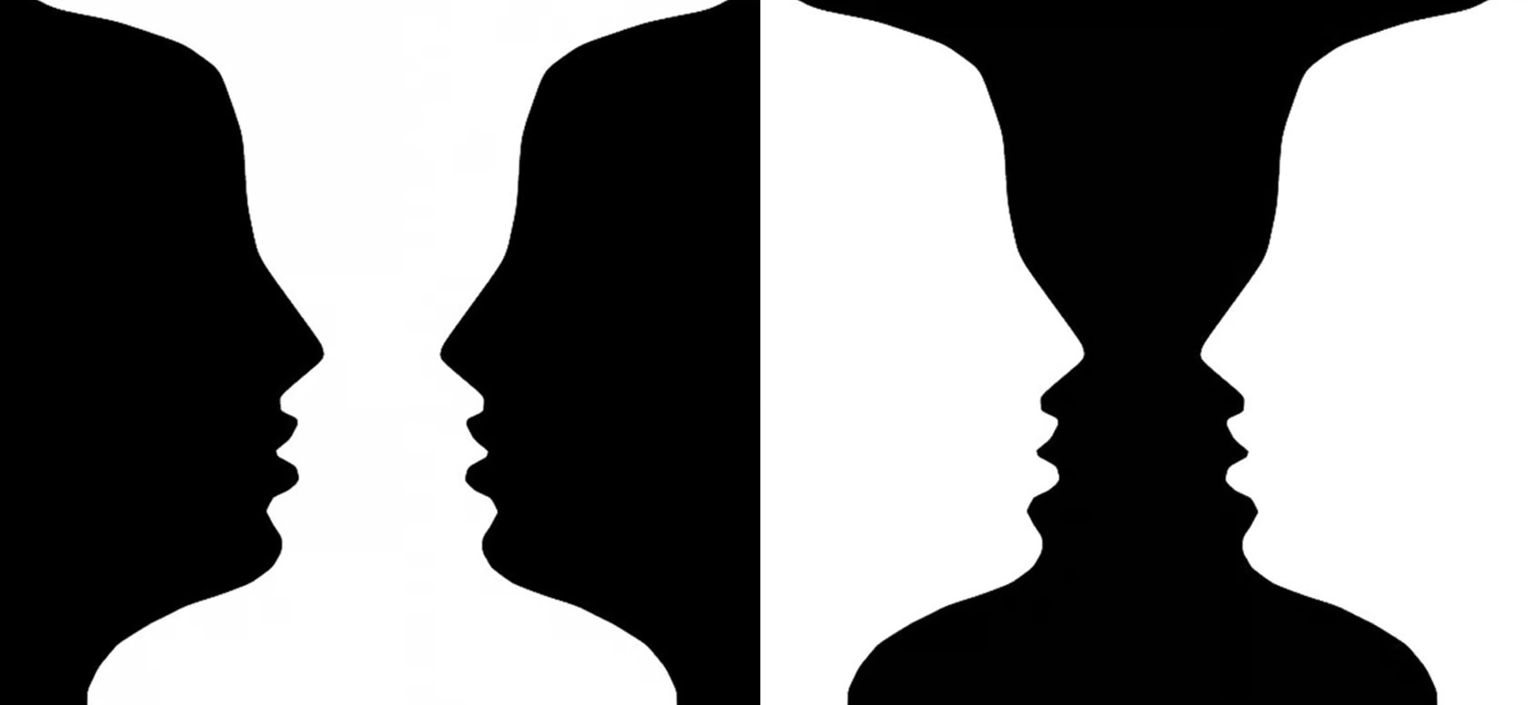
Image Source: By Cameron Chapman
The Law of Figure-Ground describes how we distinguish an object (the figure) from its surrounding background (the ground). Our focus shifts between the object and the background, depending on what we are focusing on at any given moment.
In this image, depending on where we focus, we may see either the foreground shapes as the figure or the background. This principle is often used in visual illusions, where the brain toggles between seeing two different images depending on whether it focuses on the figure or the ground.
5. Law of Continuity
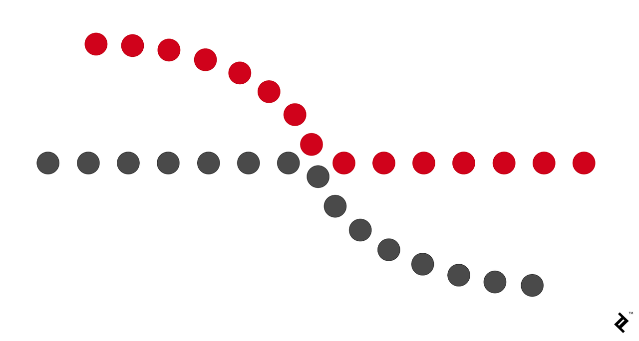
Image Source: By Cameron Chapman
The Law of Continuity states that elements arranged on a line or curve are perceived as related or continuous. This principle explains how our eyes follow the smoothest path when interpreting visual elements.
In this image, the red and gray dots form continuous curves. Even though they are separate dots, our brain perceives the curves as a single continuous path, demonstrating how continuity helps us organize visual elements in a flowing pattern.
6. Law of Common-region
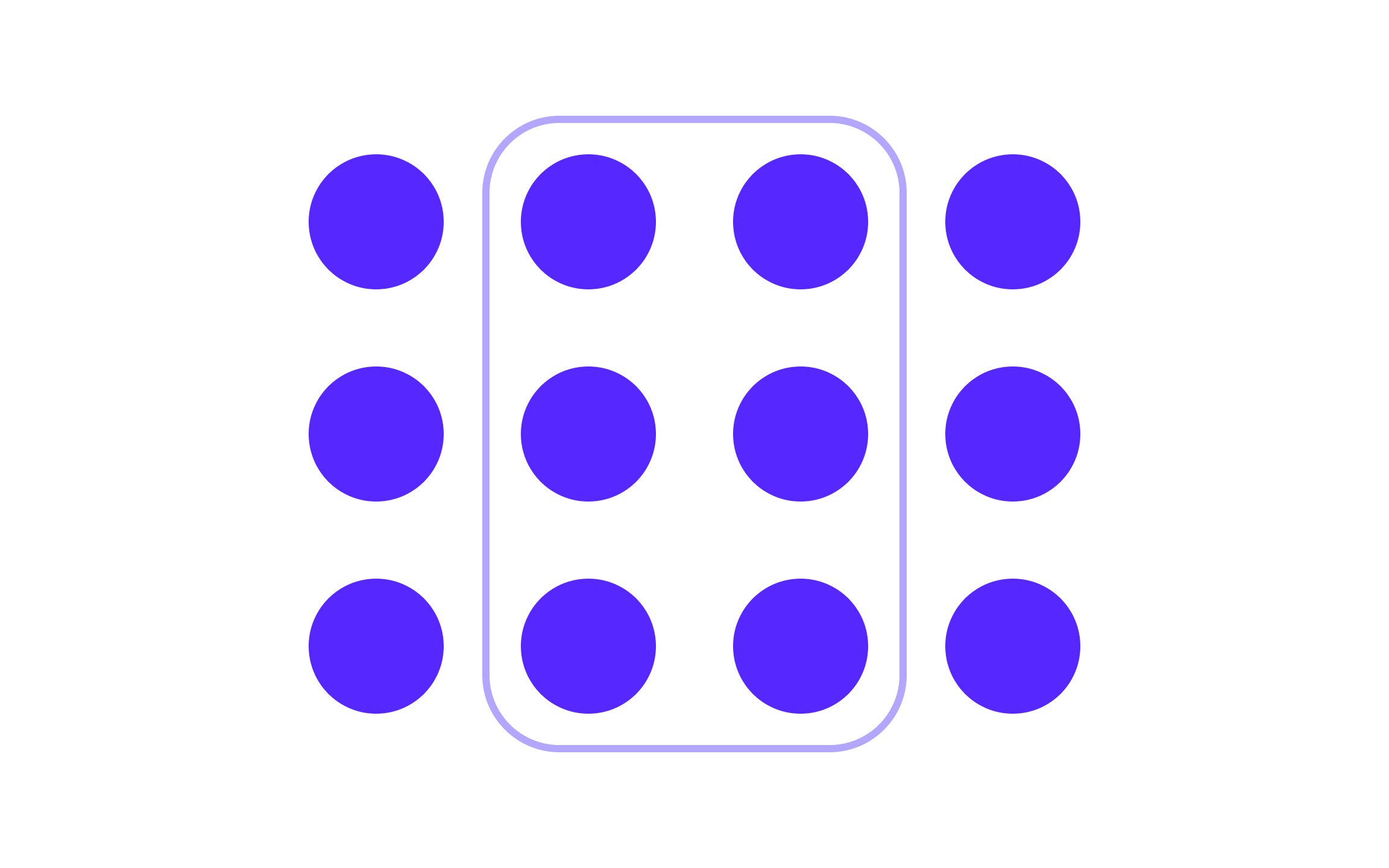
Image Source: Uxcel
The Law of Common-region states that elements located within the same boundary are perceived as part of a group. A visual boundary such as a box or a color background can create this perception of grouping, even if the elements are not physically close.
In this image, the circles inside the box are perceived as a group because they share a common region (the box). Even though the circles outside the box are the same size, shape, and color, they are seen as separate because they are not within the same boundary.
Applications of Gestalt laws in daily life
1. Confusing stairs
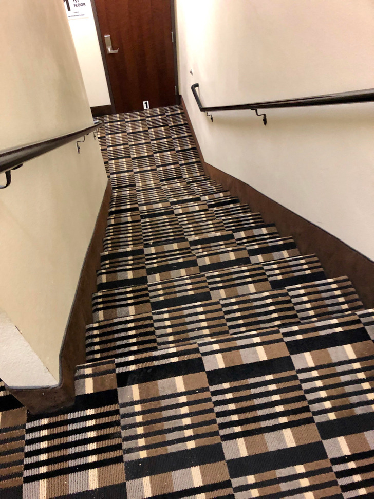
Image Source: Bright Side
Problem
Law of Continuity
- This pattern has consistent stripes, which causes our eyes to fail in distinguishing where the stairs end and begin, making the surface appear like a continuous plane. In situations where step differences need to be recognized, this pattern can create visual confusion, which poses a safety risk.
Law of Figure-Ground
- There is a lack of clear distinction between the figure (the stairs) and the background. As a result, it becomes harder to perceive the shape and depth of the stairs, and users may struggle to identify the height changes of the steps.
Solution
Clear Boundary Markings
- Adding a different colored stripe to the edges of each step can help clearly distinguish the boundary of the stairs. This will break the continuity and allow the steps to be seen as distinct units.
Enhancing Contrast
- To better separate the background and foreground, stronger color contrast can be applied to the steps. For example, using a brighter color on the edges of the stairs will help clearly define the steps, making it easier to perceive the changes in height.
2. Confusing Buttons on YES24
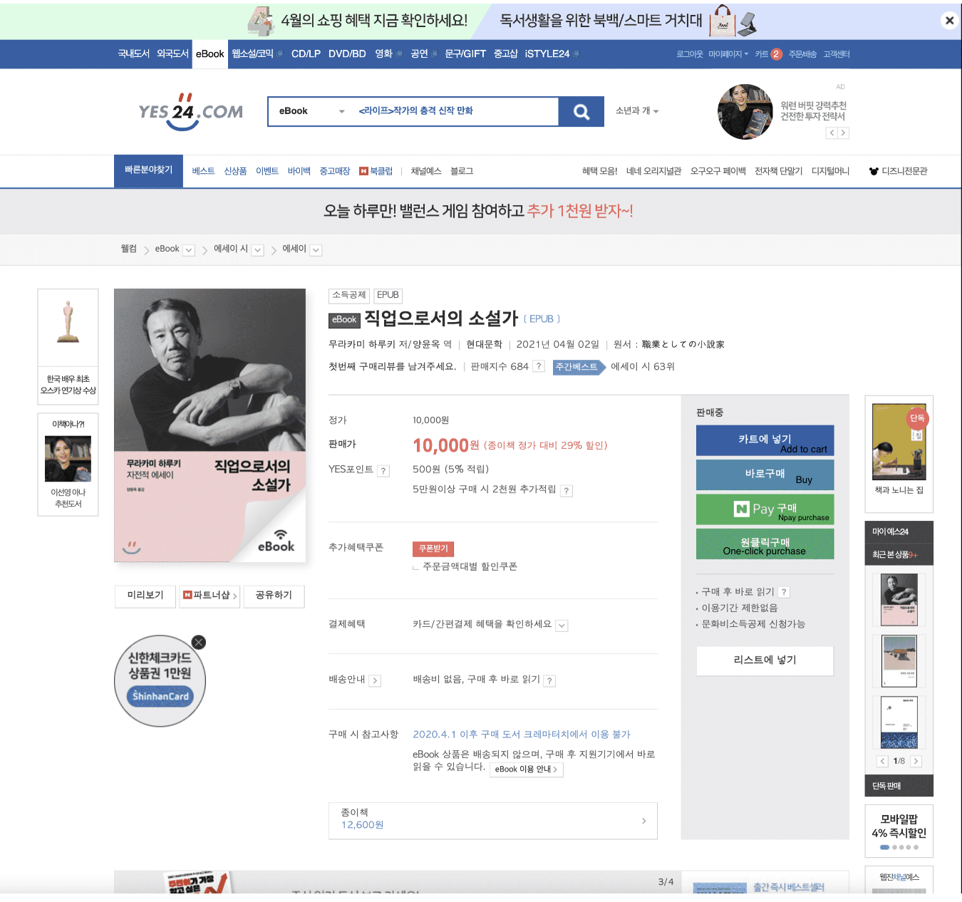
Image Source: YES24
Problem
Law of Similarity
- The NPay Purchase and One-Click Purchase buttons look similar in color, which can confuse users. Since both buttons serve different functions but appear visually similar, users may accidentally choose the wrong payment option. Because Naver’s branding is strongly associated with green, the green color of the NPay button helps signify that it is a Naver-related payment method. However, the other buttons are also visually similar, which may lead to mistaken selections.
Law of Proximity
- The Buy, Add to Cart, NPay, and One-Click Purchase buttons are placed very close to each other, which can make it difficult for users to quickly differentiate between actions. When buttons with different functions are positioned without sufficient spacing, they are perceived as part of a single group, leading to potential confusion and misclicks.
Solution
Color Differentiation
- Keep the NPay button green to signify its association with Naver, and use a different color for other purchase options, such as One-Click Purchase. This will allow users to easily distinguish between payment methods based on color, reducing the chances of accidental selections.
Spacing Adjustments
- Increase the spacing between the Buy, Add to Cart, NPay, and One-Click Purchase buttons to create a clearer separation of actions. By adding more space, each button will stand out as a distinct option, making it easier for users to select the correct action without confusion.
